Web Design Tips, Web Development Why Mobile-First Web Design Matters for UAE Businesses in 2025
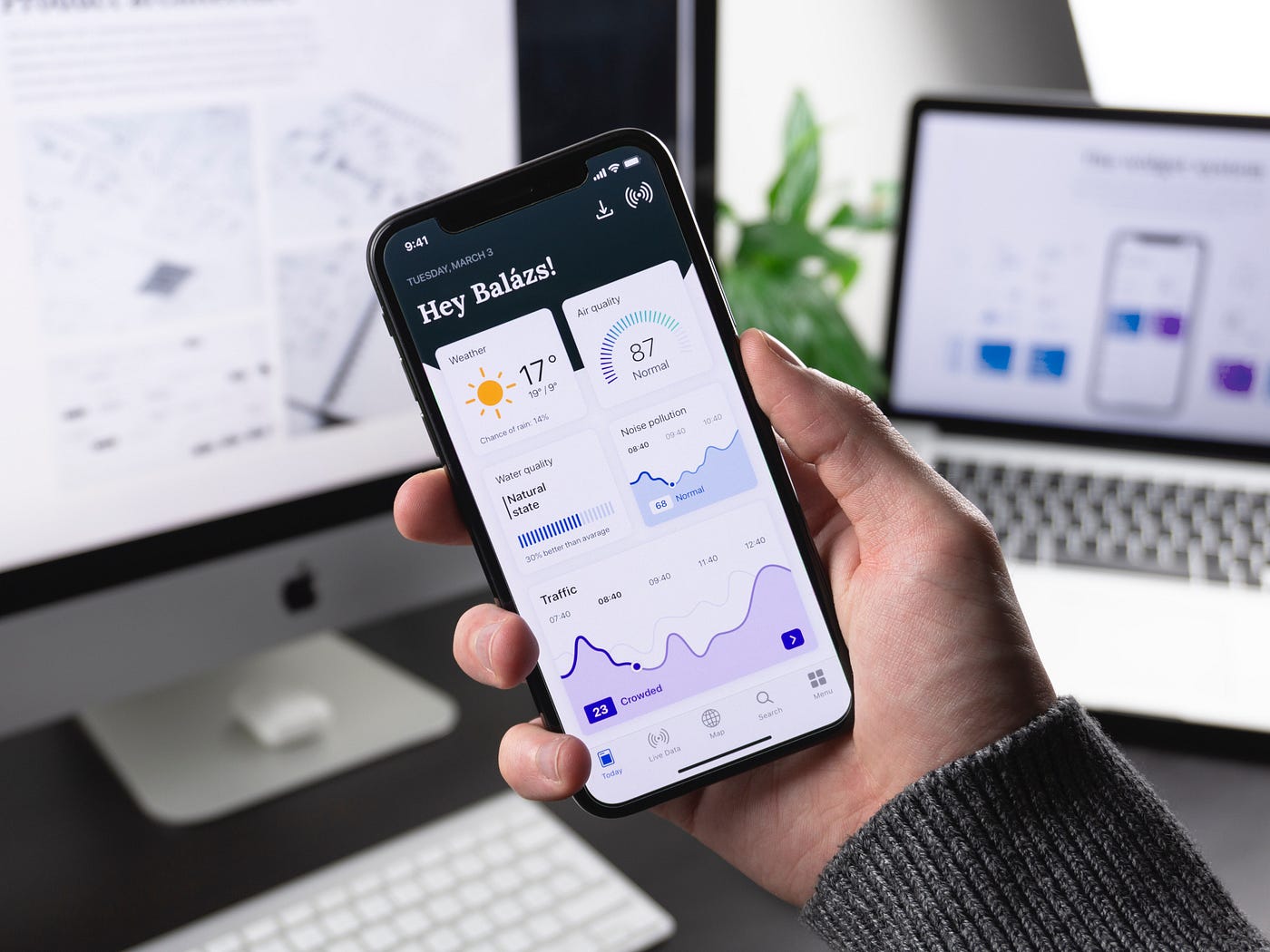
Mobile Isn’t the Future. It’s the Standard in the UAE
Scroll through a Dubai cafe, ride the Metro, or sit in a Sharjah office lobby—and what do you see? People on their phones.
In the UAE, mobile isn’t just a trend—it’s how people live, search, buy, and connect. Over 80% of website traffic in the region now comes from mobile devices. If your website isn’t built with mobile-first design principles, you’re already behind—and losing leads.
What Does “Mobile-First Design” Actually Mean?
It’s not just about being “responsive.”
Mobile-first design means designing your website for small screens first—then expanding it for desktop, not the other way around.
It forces you to:
- Focus on essentials
- Prioritize performance
- Simplify user journeys
Instead of hiding content or rearranging it later, mobile-first ensures your site is born ready for how most users interact with it.

Key Benefits of Mobile-First Web Design
1. Better User Experience (UX)
Mobile-first sites:
- Load faster
- Display cleanly on all screen sizes
- Have finger-friendly navigation
- Reduce bounce rates
Users stay longer when they can easily scroll, tap, and understand your offer in seconds.
2. Higher Google Rankings
Since 2020, Google uses mobile-first indexing. That means:
If your mobile version is slow, broken, or light on content—Google will rank you lower.
3. Increased Conversions
CTA buttons, WhatsApp integration, and quick load times mean more leads, more bookings, more sales—especially for real estate, clinics, F&B, and eCommerce brands in the UAE.
Mobile-First Features That Matter in the UAE Market
✅ Click-to-Call & Click-to-WhatsApp
✅ Scroll-triggered sticky CTAs
✅ Arabic/English toggle on mobile view
✅ Optimized image loading (WebP + Lazy Load)
✅ Touch-friendly form fields
✅ Visible opening hours, location, map
🟡 Real Example:
For a restaurant website in Dubai, we added a sticky “Book on WhatsApp” button + scroll-triggered menu previews. The result? +42% more reservation requests from mobile users in 30 days.
Signs Your Website Isn’t Mobile-First (Yet)
- Navigation menu is hard to open or read
- Pages load slowly on 4G or mobile data
- Text overlaps or feels too small
- CTA buttons are too close together
- Forms are impossible to fill on a phone
If you’re seeing any of these on your site, it’s time to rethink your design from the mobile user’s perspective.
Mobile-First vs. Mobile-Friendly — Not the Same
| Feature | Mobile-First | Mobile-Friendly |
| Design starts with mobile? | ✅ | ❌ |
| Fast-loading on mobile data? | ✅ | Maybe |
| Prioritized touch UX? | ✅ | Often missed |
| Desktop design secondary? | ✅ | Desktop-first |
| Optimized for search engines? | ✅ | Sometimes |
Final Thoughts – Be Where Your Customers Are
Mobile-first design isn’t optional anymore. In the UAE—where customers make split-second decisions on the go—it’s the difference between a lead and a bounce.
“If your website doesn’t work flawlessly on mobile, your business doesn’t work digitally.”
Want to see how your current site performs?
We’ll audit your mobile experience (for free) and suggest exactly what to improve.📞 Get Your Free Mobile UX Audit Now